About
Prinzu is a Goa-licensed tour company situated in Panjim. They provide vacation and travel plans. The brand is still in its early stages and is rapidly expanding. They are well-known throughout Goa for their private luxury yachts and cruises.
Prinzu offers a variety of packages and tours throughout Goa. It is one of the industry's leading Goa-bound travel agencies.
Brief
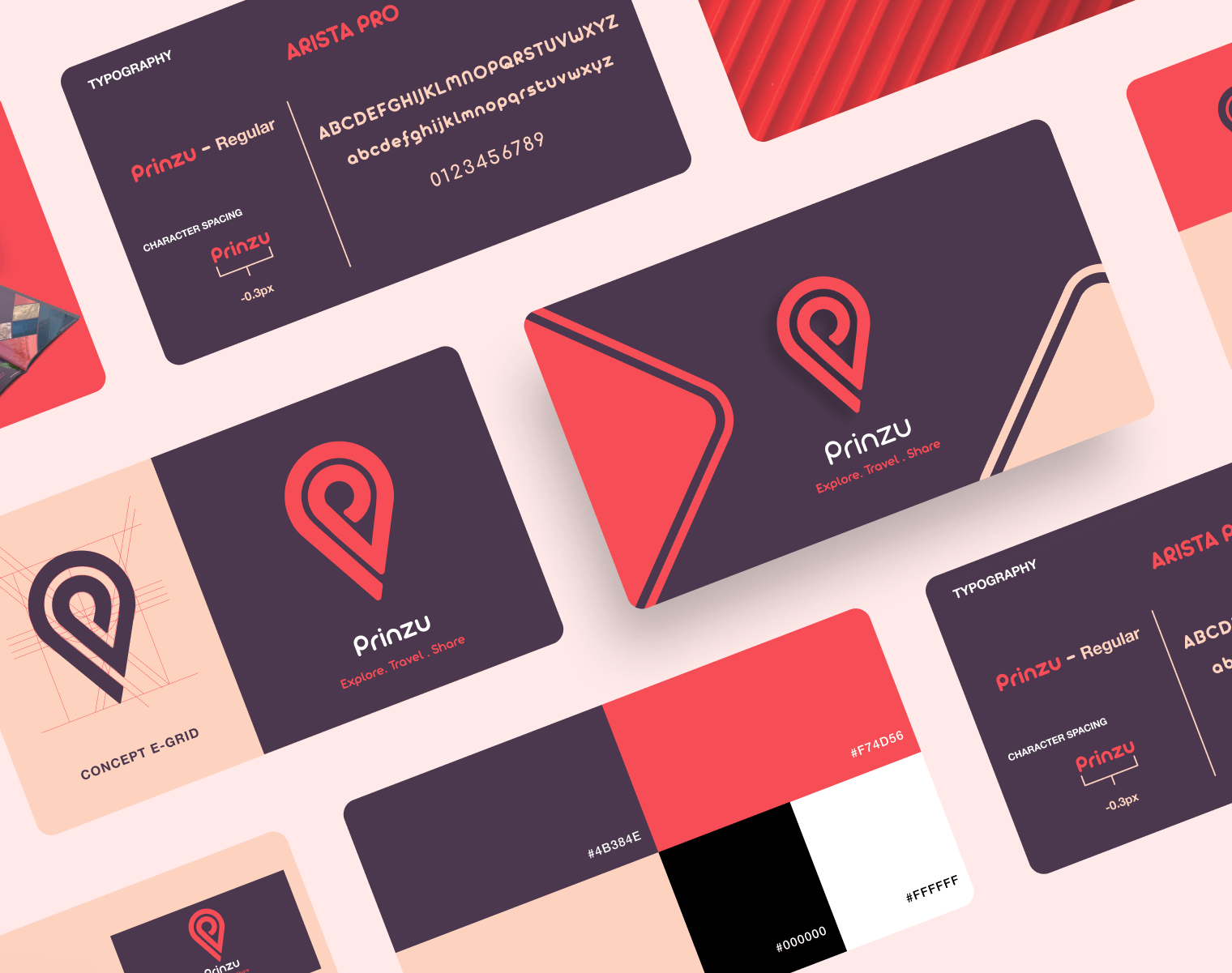
- Prinzu's first requirement was a distinct logo. As a travel brand, the color palette must be bright and cheerful. The brand believes in minimalism, which is what was communicated to us.
- The second need was to develop a website to display multiple packages, receive payments, and queries from their customers.
- The aim was to build a brand from the ground up and expand its reach throughout Goa. Because the market in which the brand (Prinzu) operates is competitive, our client was concerned with developing a distinct brand and website.
Approach
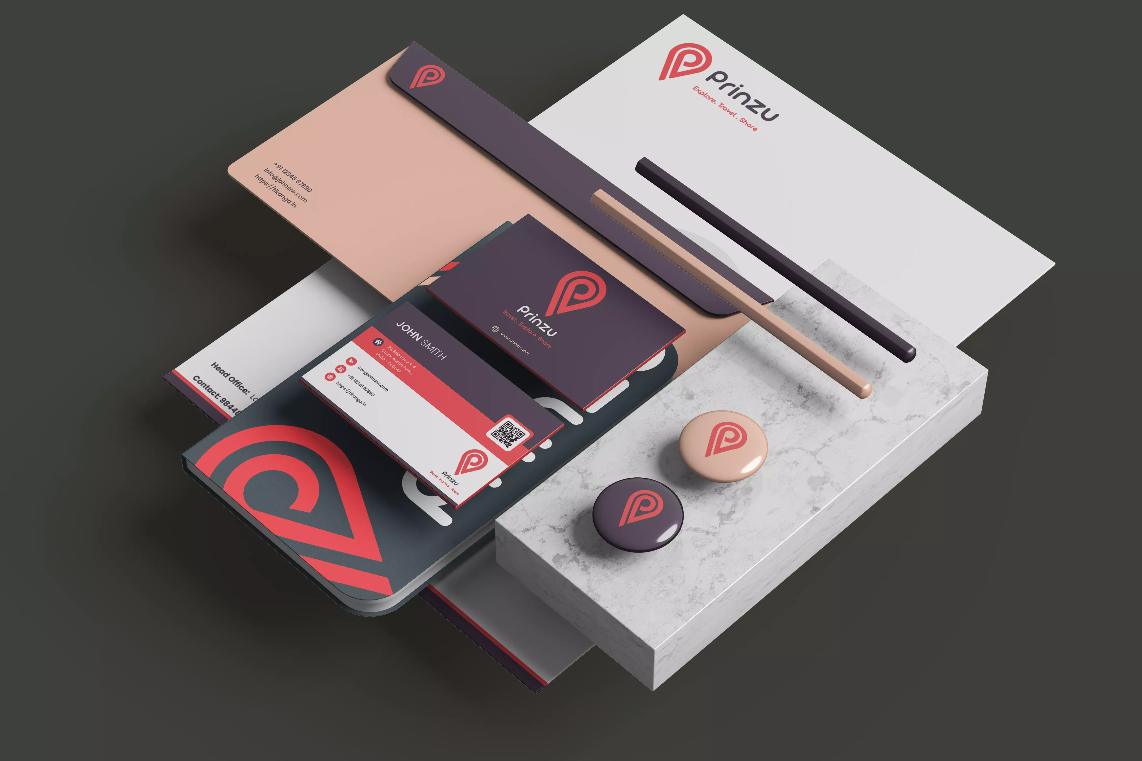
To begin, our Tikanga team had to craft the logo and brand identity system as a representation of their end-to-end travel solutions for vacationers. The goal was to:
- Maintain authenticity and brand equity
- Leverage their system's scalability across all mediums
- Provide better consistency and quality
- Facilitate increased system productivity.
The process began with sketching, as it does with any project. Rough ideas that came to mind were jotted down on paper and digitally. After much experimentation on cluttered artboards in Adobe Illustrator, a few versions were presented to the team. Following their feedback and a few more tweaks, a strong and refined design was provided. This was selected and is currently the current logo.
The font and color theory plays an important role in conveying the brand's spirit. For the logotype, a san serif font with a genuine quality that fits in with bright and cheerful principles proved to be the best choice. It reflects the company's basic beliefs and attributes of trust and dependability, attention to detail, and friendly service.
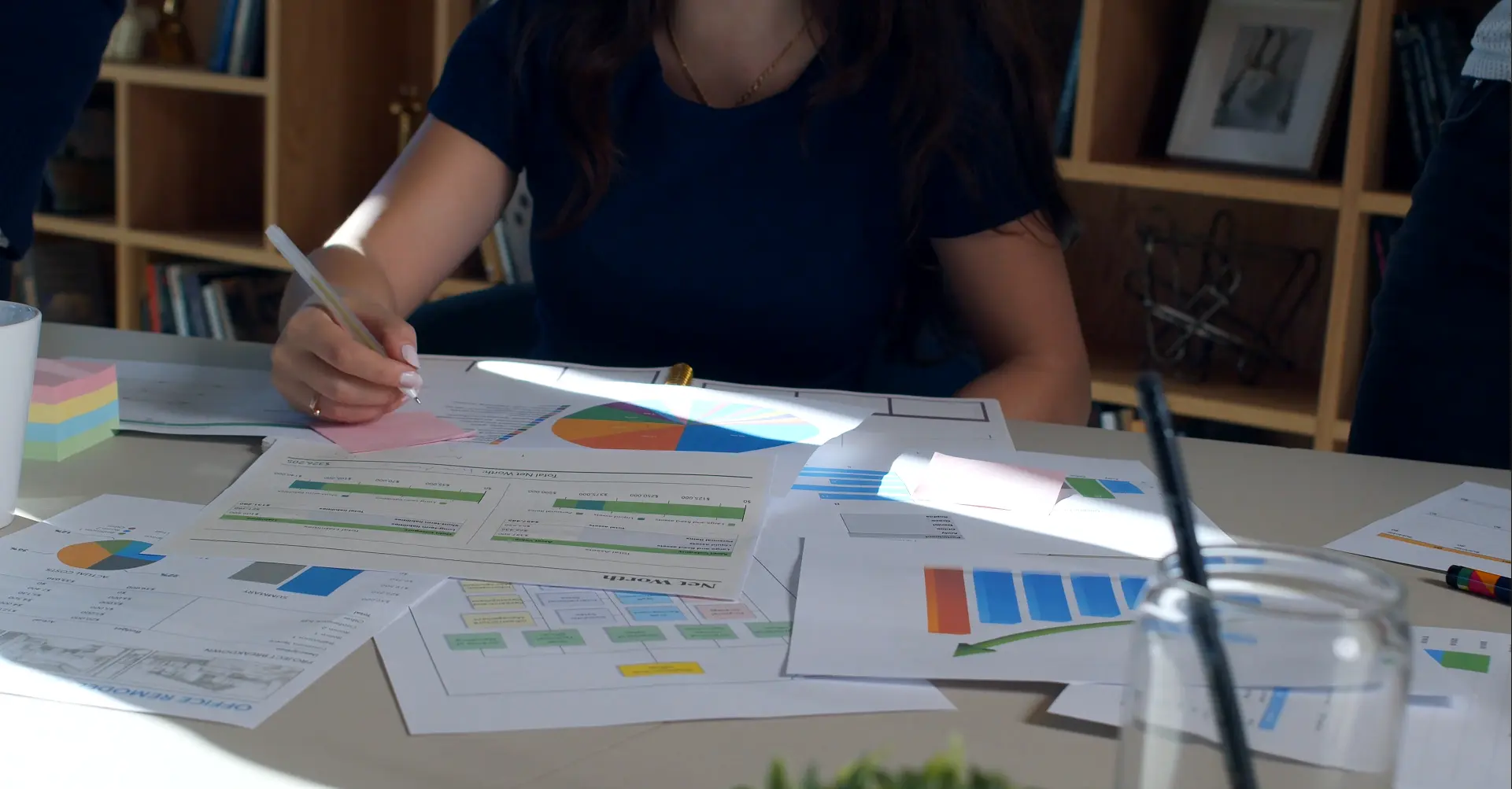
The web interface was to be designed next. We listed the required features from our clients and then created a flowchart of the website, as we follow a system at Tikanga to progress step by step.
Our Tikanga web designers designed a minimal yet attractive web design on Figma so that the we could get a sense of how a user would interact with the website and how it would look. Then, after a few alterations and iterations, we proceeded to finalize the design.
Following that, we developed the website using React as the front-end from the blueprint. The approach involved a lot of iteration before the website was given to the Prinzu team for review.
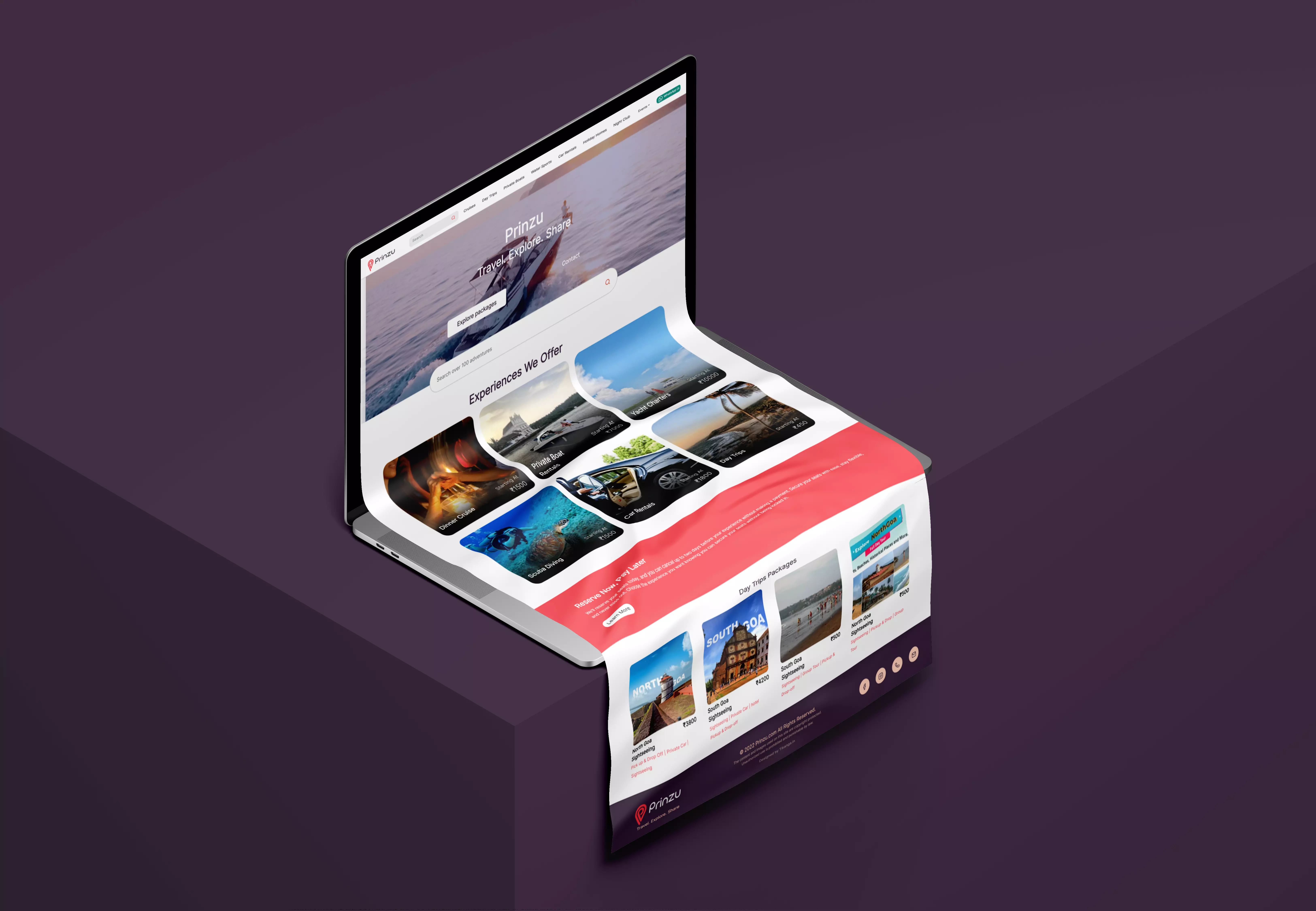
The website has unique screens for packages, categories, homepage, etc. The design principles and brand colors were maintained throughout the development of the website. Softer animations were used and content was given focus so users can make better decisions for their next trip.
The website was tested, and the errors were corrected. Furthermore, the website has been launched and is now active here. Go ahead and check it out.


